


Color for kitchen design: using the 60-30-10 rule with confidence
Choosing a color for kitchen can feel overwhelming when you must match cabinets, counters, floors, lighting and hardware. This step-by-step guide shows how to inventory fixed elements, use the 60-30-10 rule to build a balanced palette, test samples in your light, pick finishes that stand up to kitchen use, and decide when to hire a pro for cabinet spray finishing or a low-odour paint job.
What this guide gives you and a one-page checklist
Outcome: a tested dominant/supporting/accent palette you can live with, plus finish and sheen choices and a short checklist to use before buying paint or booking a contractor.
- Inventory fixed elements and lighting
- Build a dominant (60%), supporting (30%), and accent (10%) palette
- Choose sheens and durable coatings, including ZERO VOC options
- Test 2–3 large sample patches and evaluate over 48–72 hours
- Decide whether to DIY or hire professionals for cabinet spray finishing or full painting
Step 1: Assess fixed elements and lighting
Before you pick paint, make an exact inventory of what cannot be changed easily. These fixed elements determine which colours will read as dominant, supporting or accent in your space. Design guides recommend starting with this inventory so your palette lasts and reads cohesive over time. See expert guidance on long-term kitchen colour choices from Homes & Gardens for ideas and context.
Fixed elements checklist
- Cabinet doors and exposed end panels: note style, moulding and current finish.
- Countertops: photograph the full slab in natural light and note dominant tones and veining.
- Backsplash and tile: save a high-resolution photo to reference with paint chips.
- Flooring: hardwood, tile, vinyl or stone, including undertone (warm or cool).
- Hardware and fixtures: metal finish and patina, and whether you plan to change them later.
Lighting checklist and how it changes colour
Lighting alters how colours read. Natural light from north-facing windows tends to be cooler, while south- or west-facing windows bring warmer tones. Artificial light varies by bulb. Note these items and test colours at different times of day.
- Window orientation: east-facing light is cooler in the morning, west-facing light warms toward the afternoon.
- Bulb types: warm white, cool white and daylight bulbs will shift perceived hue; photograph samples under the bulbs you use.
- Task lighting and under-cabinet lighting: these create bright zones that can make colours look more saturated.
Step 2: Build your palette using the 60-30-10 rule
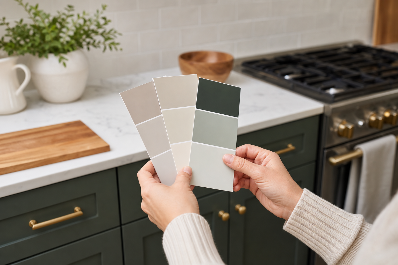
The 60-30-10 rule is a simple, repeatable way to allocate colour so a room looks balanced rather than chaotic. The rule suggests using roughly 60% of the visual field for a dominant colour, 30% for a supporting colour, and 10% for an accent. Use that framework to place colours on large and small surfaces so the kitchen reads cohesive and calm, as explained in the Kitchen Tune-Up article on the 60-30-10 rule.
How to assign the 60, 30 and 10
- 60% dominant: large surfaces such as walls, or the majority cabinet faces if you have full-height cabinetry.
- 30% supporting: secondary cabinets, island base, or large uninterrupted countertops and backsplashes.
- 10% accent: island counter edge, bar stools, hardware, light fixtures, or decorative tile and accessories.
Three sample palettes applied
These examples show practical ways to apply the rule while keeping contrast and durability in mind.
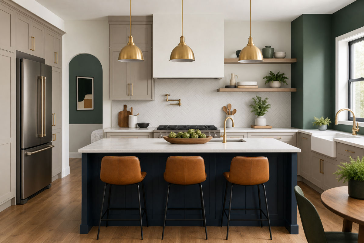
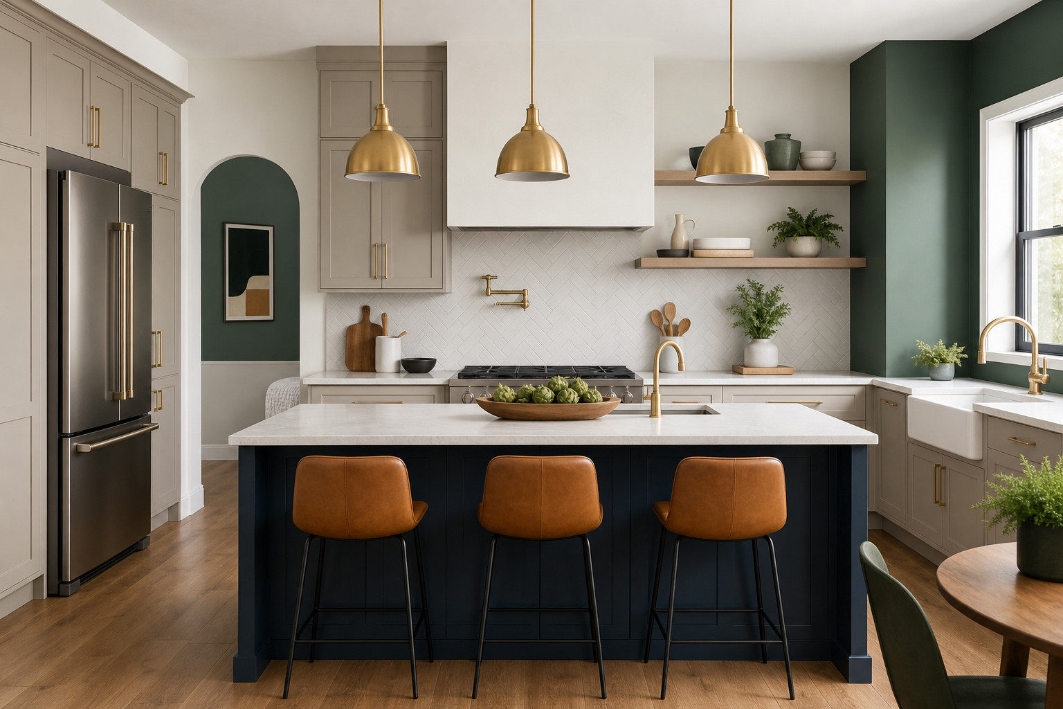
- Neutral classic: 60% warm off-white walls, 30% medium grey lower cabinets, 10% brushed brass hardware and a deep navy island. This keeps the room calm while allowing a lasting accent.
- Modern two-tone: 60% soft dove grey on upper cabinets and walls, 30% charcoal lower cabinets for grounding, 10% matte black hardware and an oak countertop edge for warmth.
- Bold accent: 60% muted beige walls, 30% white shaker cabinetry, 10% emerald green island and matching pendant shades for a single bold focus.
Step 3: Match cabinets, countertops and floors for contrast and flow
Decide whether you want contrast or a blended look. Contrast makes elements pop and hides wear, while blending creates a larger, quieter feel. A common and versatile approach is two-tone cabinetry: light uppers and darker lowers. That keeps sightlines open and creates a natural 60/30 read in many kitchens.
- Contrast rule: if counters are busy, choose a calm, solid cabinet colour so the countertop remains the focal point.
- Blend rule: if flooring is highly patterned, pick a complementary cabinet tone to avoid visual competition.
- Two-tone success: use lighter colours above eye level to make the room feel larger, and stronger, more durable colours at lower levels where scuffs are likely.
Step 4: Choose finishes and sheens for durability and low odour
Kitchens need paint that resists grease, moisture and frequent cleaning. For walls choose an eggshell or satin sheen for washability. For trim and cabinets select higher-sheen finishes where durability and cleanability matter. Home Painter Services lists ZERO VOC interior paints as a low-odour option for family-friendly projects, and offers factory-like cabinet spray finishes using professional lacquer or polyurethane coatings for smooth, durable results.
ZERO VOC paint and cabinet spray finishing options
ZERO VOC and low-odour wall paints reduce indoor odour during and after the job, which is important for families and sensitive occupants. For cabinets, professional spray finishing with lacquer or polyurethane produces a factory-style surface that handles heavy use better than most brush-applied DIY finishes. Home Painter Services describes both approaches and includes Free Color Consultation and Free Estimate Visit services to help homeowners choose the right coatings for their needs; see the Home Painter Services services page for details.
Step 5: Test paint samples in your kitchen and evaluate them
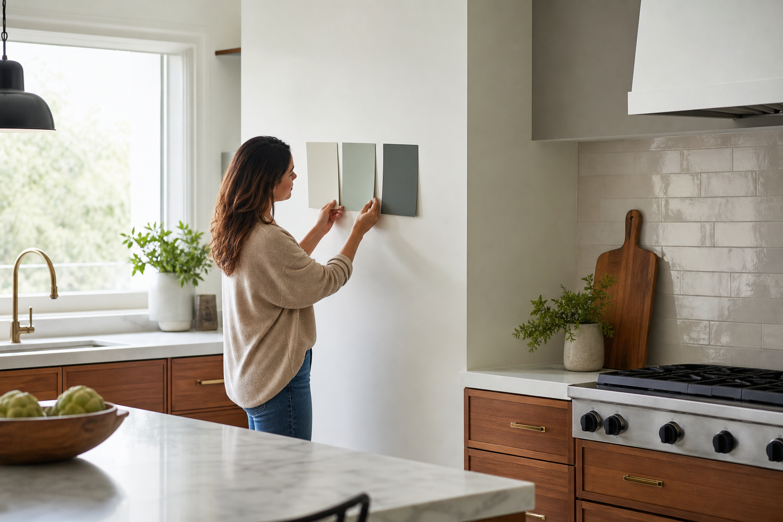
Never choose a colour from a chip card alone. Buy 2–3 sample pots and apply large patches where cabinets, walls and countertops meet. Live with the samples for 48–72 hours and observe them in morning, afternoon and evening light. Design guides recommend this multi-time testing so you can catch shifts caused by light and reflective surfaces.
Where and how to place test patches
- Patch size: apply each sample in areas at least 30 by 30 centimetres so you can read the colour from normal standing and seated positions.
- Patch placement: one near a window, one near artificial task lighting, and one on a cabinet door hung in place for the most accurate match.
- Label and photograph: mark each sample and take photos at the same time over a two-day window to compare how the tone shifts.
- Watch for metamerism: a colour that matches one surface at noon may no longer match under warm bulbs, so test with your actual bulbs in place.
When to DIY and when to hire a professional
Use this simple decision rule. DIY if surfaces need light sanding, no structural repairs are required, and you are repainting walls or trim with minimal finish work. Hire a professional if you need factory-like cabinet spray finishes, extensive surface preparation, diamond-grind concrete prep for specialty floors, or if occupants are highly sensitive to odour.
Home Painter Services lists factory-like spray finishes for kitchen cabinet refinishing and ZERO VOC interior paints as services tailored to homeowners who want low disruption and durable results. Booking a Free Color Consultation and Free Estimate Visit helps you understand scope and expected prep before work starts.
Common homeowner objections and a practical decision checklist
Homeowners often worry about odour, disruption, colour regret and cost. Use this checklist before you accept a quote.
- Durability: choose cabinet finishes rated for heavy use and wall sheens that are washable.
- Maintenance: darker bases and higher-sheen trims clean more easily.
- Cohesion: test samples with adjoining rooms visible to avoid jarring transitions.
- Budget and timeline: get a free written estimate and ask about the provider’s on-time completion promise so you can plan around the project.
- Health and comfort: ask about ZERO VOC and ventilation plans if occupants are sensitive to paint fumes.
Next steps for Mississauga and GTA homeowners and what to expect
If you live in Mississauga, Oakville or nearby in the GTA and you want professional help, Home Painter Services offers Free Color Consultation and Free Estimate Visit options. During a free visit the team typically inspects fixed elements, discusses finishes and timelines, and provides a written scope and estimate so you can decide with confidence. The company also promotes a Guaranteed On-Time Completion promise to reduce scheduling uncertainty; read more on their services page.
To book a consultation or an estimate, note your fixed-element photos, sample inspiration images and availability, then contact the team to arrange the visit and ask about ZERO VOC paint and cabinet spray finishing options.
Frequently asked questions
What does the 60-30-10 rule mean for a kitchen with existing dark cabinets?
If cabinets are dark and you cannot replace them, use them as the 30% supporting colour and select a lighter 60% for walls to keep the room bright. Add a 10% accent in hardware or an island colour to give contrast and cohesion.
Can I use ZERO VOC paint for my kitchen walls and still get a durable finish?
Yes. ZERO VOC interior paints are available in durable formulations suitable for kitchen walls. They reduce odour during application, which helps families and sensitive occupants. For heavy-use surfaces like cabinets, professional lacquer or polyurethane spray finishes are often preferred for longevity.
How large should paint test patches be and how long should I live with them before deciding?
Apply patches at least 30 by 30 centimetres and view them from normal distances. Live with the samples for 48 to 72 hours and check them at different times to confirm how light and reflections alter the hue.
When is cabinet spray finishing a better value than repainting by hand or replacing cabinets?
Cabinet spray finishing is often the best value when cabinets are structurally sound but the finish is worn or dated. Spray finishes provide a factory-like, durable surface with less demolition and a lower cost than full replacement, while delivering better consistency than brush-applied finishes.
How do lighting choices affect the colour I see on painted cabinets versus walls?
Light direction and bulb temperature change perceived colour. Warm bulbs will make colours warmer and richer, while cool daylight will lean them toward blue. Test both cabinet and wall samples under your actual lighting to avoid surprises.
For more on the 60-30-10 approach see the Kitchen Tune-Up article on the rule and the Homes & Gardens guide to choosing kitchen colour schemes. When you are ready, Home Painter Services offers Free Color Consultation and Free Estimate Visit options and can help Mississauga and Oakville homeowners test palettes, choose ZERO VOC products, or schedule professional cabinet spray finishing with factory-like lacquer or polyurethane coatings. Book a visit to get a written estimate and a clear plan for on-time completion.
