

Neutral colors are balanced paint hues—like white, beige, greige, taupe, and gray—that create a calm, versatile backdrop for furniture and art. They reflect light predictably, hide minor imperfections, and make rooms feel cohesive. For homeowners near 316 Bergamot Ave, neutrals pair well with our ZERO VOC paints and durable finishes used across interior and exterior projects.
By ZIKRIA MUJAHID • Last updated: 2026-06-23
Above-Fold Section (Hook + TOC)
Use neutral colors to build a timeless base, boost perceived space, and simplify future updates. Start with undertones, match sheen to room use, and test swatches in morning, afternoon, and evening light. This guide includes quick picks, best practices, tools, and real Milton-area examples.
You want rooms that feel calm today and still look great next year. That’s exactly what a well-planned neutral palette delivers—without boxing you into a single design style or trend.
- What neutral colors really are (and what they aren’t)
- Why undertones and LRV decide how a color looks on your wall
- How to layer walls, trim, and accents so spaces feel complete
- Room-by-room sheen mapping that stands up to family life
- Pro sampling methods we use on interior, exterior, and cabinets
- Real examples from homes around 316 Bergamot Ave
If you’re new to paint selection, our interior paint guide is a helpful companion for this article.
Overview
Neutral color palettes center on balanced hues—off-whites, beiges, grays, and greiges—with subtle undertones. They’re flexible, renter- and resale-friendly, and make maintenance easier. Pair them with ZERO VOC paint, proper prep, and the right sheen to improve durability and indoor air quality.
In our experience across Mississauga and Milton homes, a neutral foundation simplifies how you decorate, clean, and even plan future projects. Because these hues have low chroma, they don’t compete with wood grains, countertops, tile, or textiles. That keeps visual noise down and helps small rooms feel larger.
We also think about longevity. Premium exterior neutrals resist UV fade better when combined with flexible, weather-rated resins. Cabinet neutrals sprayed in professional lacquer or polyurethane look “factory new” and tolerate thousands of opens and closes. In garages, a neutral flake epoxy hides dust between sweeps and mutes tire marks under bright lights.
What Are Neutral Colors?
Neutral colors are low-chroma hues—white, cream, beige, taupe, gray, greige, and black—that read as quiet backdrops. They balance warm and cool undertones, making them adaptable across rooms, lighting, and styles from modern to traditional.
Think of neutrals as the stage, not the star. They let wood tones, stone, and art shine while giving you freedom to rotate pillows, rugs, and decor without repainting. Because their chroma is restrained, they layer easily and make minor drywall texture less obvious than many saturated colors.
Undertones separate one neutral from another. You’ll see subtle shifts like:
- Warm undertones: soft yellow, red, or pink casts in beige and taupe.
- Cool undertones: blue or green tints in gray families.
- Balanced undertones: greige hybrids that bridge warm floors and cool counters.
- Deep neutrals: charcoal and near-black that add contrast without heavy saturation.
Why this matters: two swatches that look identical in a fan deck can read completely different on your wall at 2 p.m. vs. 8 p.m. That’s light interacting with undertone. We test samples on at least two walls and review them morning, afternoon, and evening—three checkpoints that save repaints later.
Numbers help here. Light Reflectance Value (LRV) runs from 0 (pure black) to 100 (pure white). Most livable neutrals fall between 30 and 90. A shift of even 5–10 LRV points can change how airy a room feels, especially in hallways or spaces with a single window.
Curious about adding a single bold wall to a neutral scheme? These ideas pair perfectly with calm backdrops—see our practical feature wall tips.
Why Neutral Colors Matter
Neutrals boost perceived space, reduce color clashes, and increase flexibility for furniture and art. They’re easier to maintain, touch up, and repaint. When paired with low- or zero-VOC coatings, they also support healthier indoor environments for families.
Homeowners choose neutrals for practical reasons first. Visual calm reduces decision fatigue when you’re mixing woods, metals, and fabrics. It also speeds up makeovers—swapping pillows, throws, or a rug can shift the mood without touching a roller. That’s real flexibility week to week, not just at renovation time.
- Space perception: Lighter neutrals (LRV 60–85) bounce more light, which makes small rooms feel larger.
- Design cohesion: One whole-home neutral unites different floors and fixtures across levels.
- Family-friendly: ZERO VOC formulas limit odors; satin and eggshell wipe clean quickly.
- Resale-readiness: Timeless palettes reduce buyer objections and photography glare.
Durability ties it together. On cabinets, a sprayed lacquer or polyurethane in soft white or greige stands up to thousands of cleanings. For exteriors, neutrals with high-quality resins resist UV and moisture cycles that can cause early fading. In garages, neutral flake blends disguise dust so you aren’t mopping every weekend.
We build these choices into our process: meticulous surface prep, targeted primers, and zero-VOC interiors wherever families request low odor. It’s the reason our neutral projects still look crisp after busy seasons of kids, pets, and guests.
How Neutral Palettes Work With Light
Light Reflectance Value (LRV) indicates how much light a color reflects on a 0–100 scale. Higher LRV neutrals brighten spaces; lower LRVs add coziness. Always test swatches under natural and artificial light to confirm undertones before committing.
Light direction changes color—full stop. North-facing rooms tend to look cooler and flatter by midday; south-facing rooms feel warmer and brighter for more hours. West light adds warmth late in the day, which can make some grays flash purple or blue-green. East light can wash out deeper tones in the morning and then settle by afternoon.
- LRV 70–90 (soft whites): great for ceilings and trim to raise perceived height.
- LRV 50–69 (light neutrals): balanced walls in living spaces and open-concept plans.
- LRV 30–49 (mid-tones): cozy media rooms and bedrooms; also handsome on exteriors.
- LRV 10–29 (deep neutrals): cabinet runs, interior doors, and accent walls for contrast.
Bulb temperature matters, too. Most homes use 2700K–3000K lamps (warm) with occasional 4000K (cooler task light). A 3000K bulb can push a gray visibly warmer; 4000K can pull warmer beiges back toward neutral. We log bulb types during consultations so your chosen paint still reads right after we pack up.
Sheen changes perception as well. Moving from matte to eggshell can make a color appear one “value” lighter because eggshell reflects more light. We’ll often sample the same neutral in two sheens on a primed board so you can see glare, wipeability, and texture before painting full walls.
Types, Methods, and Approaches
Build a neutral scheme by picking a base hue, confirming undertone, and layering light-to-dark values. Use one whole-home neutral for cohesion, then add deeper accents on doors, cabinets, or a focal wall for depth and contrast.
The fastest route to a pulled-together home is a “spine and accents” approach. Choose one wall color that works almost everywhere, lock in a trim/ceiling white, then sprinkle two or three deeper notes where you want emphasis. Here’s how we map that plan.
Common neutral families
- Warm neutrals (beige, taupe): pair with oak, brass, and earthy textiles for inviting rooms.
- Cool neutrals (gray): pair with chrome, marble, and blue accents for crisp, modern spaces.
- Greige (gray-beige blend): bridges warm floors and cool counters in open plans.
- Off-white and cream: reliable for trims, ceilings, and minimalist walls.
- Charcoal and near-black: ideal for statement doors, built-ins, and exterior accents.
Layering approach that works
- Choose your base: a light neutral (LRV ~55–75) for most walls.
- Add a mid-tone: one shade darker for dens, hallways, or dining nooks.
- Define trim/ceilings: an off-white 10–20 LRV points lighter than walls.
- Create a focal: a deep neutral accent (LRV 10–25) on a fireplace, built-in, or cabinet run.
Where neutrals shine in our services
- Interior painting: Whole-home cohesion in eggshell or satin; see our interior painting services for process details.
- Kitchen cabinets (spray): Smooth greige or soft white in durable lacquer or polyurethane.
- Garage epoxy floors: Gray-beige flake blends to disguise dust and wear under bright lights.
- Deck and fence staining: UV-stable warm neutrals that complement brick and stone.
- Exterior paint: Balanced siding neutrals with high-contrast trim for curb appeal.
Want one wall to pop without breaking the calm? Pair your scheme with the ideas in our feature wall tips and keep the rest of the room grounded.
Best Practices for Choosing and Using Neutrals
Test at least three swatches per room, review at three times of day, and confirm sheen on a primed sample board. Pair ZERO VOC paint with meticulous prep—cleaning, repairs, sanding, and priming—for smoother finishes and healthier indoor air.
Sampling removes 90% of surprises. Large-format samples (8–12 inches) show undertone shifts that tiny chips hide. We place them near trim, counters, and floors so you can see how each surface “talks” to the paint under real light. A simple phone photo taken morning, afternoon, and evening helps lock choices with confidence.
What to test and why
- Undertone checks: Compare swatches against pure white and a known gray to reveal warmth or coolness.
- Light cycle: View samples morning, afternoon, and evening; take quick photos to compare.
- Sheen boards: Paint a letter-size board in matte vs eggshell to see glare and wipeability.
- Trim contrast: Keep trims 10–20 LRV points lighter than walls for crisp edges.
Finish mapping (easy rule of thumb)
- Ceilings: flat for low glare and uniformity.
- Walls: eggshell or matte in low-traffic; satin in hallways and kids’ rooms.
- Trim/doors: semi-gloss for durability and easy cleaning.
- Cabinets: professional lacquer or polyurethane for a factory-grade look.
Good prep multiplies paint performance. Cleaning, patching, sanding, and priming improve adhesion and sheen uniformity so the neutral you chose actually looks like itself. Indoors, low- and zero-VOC products reduce odor during application and after; most interior acrylics dry to touch in 1–2 hours and cure fully over 7–30 days—so plan gentle cleaning at first.
| Palette | Undertone | Typical LRV | Best Use | Pairs With |
|---|---|---|---|---|
| Warm beige/taupe | Yellow/red | 40–70 | Living rooms, bedrooms | Oak, brass, warm textiles |
| Cool gray | Blue/green | 30–60 | Kitchens, offices | Chrome, marble, blue accents |
| Greige | Balanced | 45–65 | Open-concept spaces | Mixed metals, varied floors |
| Off-white/cream | Subtle warm | 70–90 | Ceilings, trim, minimalist walls | Any wood tone, black accents |
| Charcoal/near-black | Neutral/cool | 10–25 | Doors, cabinets, accent walls | Light siding, stone, warm woods |
Local considerations for 316 Bergamot Ave
- For exteriors near Tremaine at Bergamot, choose balanced neutrals that complement stone and brick seen in the neighborhood streetscape.
- Shade shifts around Walker Park can cool facades in late afternoon—verify undertones with on-site samples before painting siding or doors.
- Seasonal swings mean expansion/contraction; pair neutral exteriors with premium, flexible coatings and fresh weatherproof caulking.
Planning a bigger refresh with one bold surface? A single accent alongside neutrals delivers impact without visual clutter—our feature wall tips walk through placement and finish.
Tools and Resources
Use LRV charts, large-format peel-and-stick samples, and a simple lighting checklist to confirm undertones before you paint. Pair those with pro-grade prep tools—sanders, caulk, and tack cloths—to achieve a smoother neutral finish that lasts.
We keep selection simple with three tools: a swatch kit, a light/fixture checklist, and a sheen board set. Together, they replace guesswork with quick, confident decisions you won’t have to revisit in six months.
- LRV + swatch kit: Track values room by room to avoid surprises across floors.
- Lighting checklist: Note bulb temperature (2700K–4000K), fixture type, and window orientation.
- Prep kit: Filler, sanding sponges, primer, and caulk for crisp lines and uniform sheen.
- Finish samples: Matte vs eggshell vs satin boards for each candidate neutral.
If you enjoy reading how-tos, this step-by-step interior painting overview is a useful refresher. For cabinets, browse kitchen cabinet color ideas and a concise white vs gray cabinets comparison before we spray your final choice in a durable, factory-grade finish.
For our full interior workflow and protections, see the detailed overview in our interior painting services. If you’re weighing timelines, our painting cost factors article explains scope variables without numbers.
Case Studies and Real-World Examples
Neutrals succeed when they bridge finishes you already own. We combine LRV, undertones, and sheen to tie together floors, counters, and fabrics—then apply pro coatings for durability on walls, cabinets, exteriors, and garage floors.
Open-concept interior repaint
Challenge: Warm oak floors clashed with cool quartz counters. The original gray cast blue under west light.
- Plan: A balanced greige (LRV ~60) for walls; off-white trim ~15 LRV points lighter.
- Sheen: Eggshell on walls for wipeability; semi-gloss on trim for durability.
- Result: Brighter by day, cozy at night; fewer color fights with furnishings.
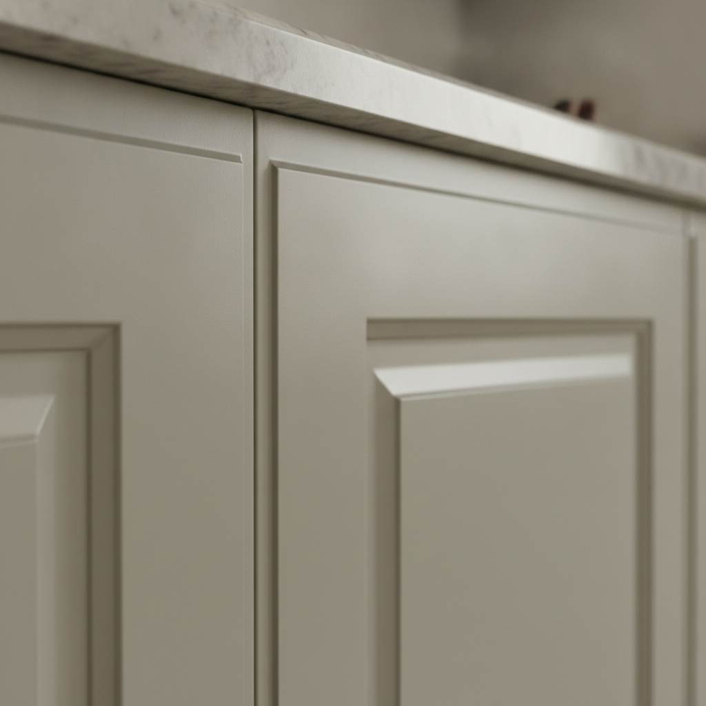
Kitchen cabinet spray transformation
Challenge: Honey-oak cabinets turned orange under 3000K LEDs, overpowering the room.
- Plan: Factory-grade spray in a soft greige lacquer; satin sheen to balance glare and cleanability.
- Prep: Degrease, scuff-sand, prime; then multiple thin coats for a uniform film build.
- Result: A “new kitchen” feel without a full renovation; undertones aligned with quartz veining.
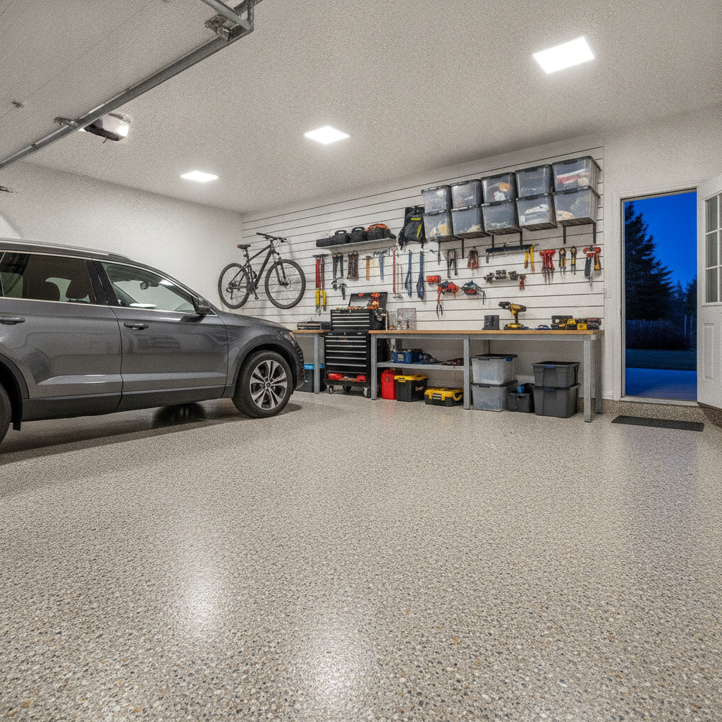
Garage epoxy in a neutral blend
Challenge: Bare concrete showed dust and tire marks within hours.
- Plan: Diamond grinding, then a gray-beige flake epoxy system to mask debris; bright, even lighting.
- Durability: Industrial resin with a poly topcoat for chemical and abrasion resistance.
- Result: Cleaner day-to-day look and easier sweeping between washes.
Exterior refresh near Walker Park
Challenge: Late-afternoon shade cooled the facade so the old beige looked gray and dingy.
- Plan: Balanced siding neutral (mid-LRV) with a crisp, lighter trim and a deep charcoal door.
- Upkeep: Gentle power washing twice per season; fresh, flexible caulking at joints.
- Result: Higher contrast and year-round definition without clashing with neighboring brick.
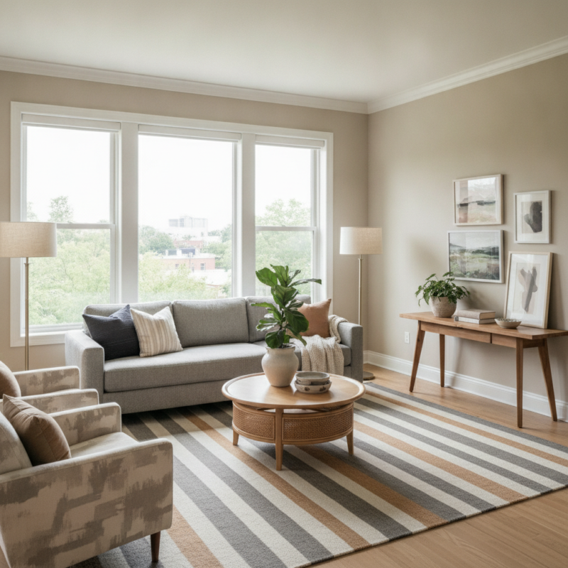
Living room calm without losing character
Challenge: Gallery wall and bookshelves felt busy against a saturated backdrop.
- Plan: Shift to a light neutral around LRV 65; keep shelves a step deeper for depth.
- Detail: Trim 20 LRV points lighter to frame art and create crisp shadow lines.
- Result: Art popped; the room felt larger with the same furniture layout.
We include a Free Color Consultation and a Free Estimate Visit with our projects. Ask us to map LRVs and undertones for your spaces, then schedule painting with our Guaranteed On-Time Completion promise.
Frequently Asked Questions
Pick neutrals by reading undertones, checking LRV, and testing samples under your real lighting. Keep trims lighter for crisp edges, and choose durable sheens for traffic. When in doubt, start with one cohesive whole-home neutral, then add deeper accents.
What are the most versatile neutral colors?
Greige (a gray-beige blend) is the safest bridge between warm floors and cool counters. Light taupe, soft gray, and off-white also work almost anywhere. Confirm with large samples in your home’s morning, afternoon, and evening light.
How do I choose a neutral for north-facing rooms?
North light is cooler, so lean into warm neutrals—beige, taupe, or a warm greige. Target an LRV around 55–70 to keep the space bright, then test sheen (matte vs eggshell) to avoid glare on smooth walls.
What sheen is best for neutral walls with kids and pets?
Eggshell or satin. Both are easier to wipe than matte and hide minor wall texture better than semi-gloss. Use semi-gloss on trim and doors for durability, and keep cabinets in a professional lacquer for a true factory finish.
Do neutral exteriors look flat?
Not when you vary depth and texture. Pair a balanced siding neutral with darker doors and light trim, then add wood or stone accents. The contrast and materials prevent a washed-out look while staying timeless.
Conclusion and Next Steps
Start with a single whole-home neutral that respects your floors, counters, and light. Confirm LRV and undertones with on-wall samples, then map sheen by room. Add deeper accents on doors, cabinets, or a focal wall for depth—without sacrificing calm.
Here’s a simple action plan you can use right away.
- Pick 3–4 candidates and label LRV and undertone on each sample.
- Test them on two walls per room and check morning, afternoon, evening.
- Lock in trim and ceiling whites that are 10–20 LRV points lighter than walls.
- Schedule prep and paint with ZERO VOC options for low odor and easy living.
Key takeaways
- Neutrals are low-chroma, light-bending team players—not boring placeholders.
- LRV, undertone, and sheen determine how your color reads in real life.
- One cohesive base plus a few deep accents keeps rooms calm yet dimensional.
- Prep and premium coatings turn good colors into great-looking, durable finishes.
Ready to see samples at your place near 316 Bergamot Ave? Book a free consultation and we’ll bring peel-and-stick swatches, test boards, and sheen options—plus a clear plan to finish on time.